

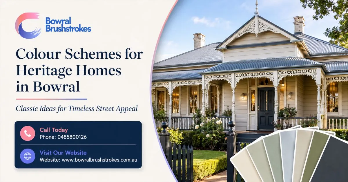
Choosing colours for an older home can feel exciting and risky at the same time. You want the house to look fresh, elegant, and well cared for, but you also do not want to strip away the character that made you love the property in the first place.
That is why colour schemes for heritage homes in Bowral need more thought than a standard repaint. A Federation weatherboard, Victorian cottage, Edwardian home, traditional brick house, or heritage-style Southern Highlands property can look beautiful with the right palette — but the wrong colours can make original details feel flat, modernised in the wrong way, or out of place in the streetscape.
This guide from Bowral Brush Strokes explains how to choose heritage home colours in Bowral, how to balance tradition with modern liveability, what colour combinations suit different architectural styles, and when to check council or heritage requirements before repainting.
With 11 years of painting experience, Bowral Brush Strokes helps local homeowners choose colours that respect the home’s age, suit Bowral’s country-style setting, and create a finish that feels classic, considered, and lasting.
The best colour schemes for heritage homes in Bowral usually use soft neutrals, warm whites, muted greens, deep reds, creams, stone tones, greys, charcoals, and traditional trim colours. The right palette should suit the home’s period, roof, brickwork, timber details, verandah, garden setting, and any heritage or council requirements.
Best Colour Schemes for Heritage Homes in Bowral
The best heritage colour schemes in Bowral are usually timeless, balanced, and sympathetic to the home’s age, materials, streetscape, and surrounding landscape.
Heritage-style homes often look best when the palette highlights original features instead of overpowering them. The goal is not always to make the house look brand new. Often, the goal is to make it look beautifully maintained while keeping its period character.
Good Heritage Colour Families
Common colour families for heritage homes include:
- Warm whites
- Soft creams
- Stone and sandstone tones
- Muted greys
- Deep greens
- Burgundy and oxblood reds
- Charcoal and off-black trims
- Soft blues and blue-greys
- Dusty sage
- Olive green
- Heritage beige
- Warm taupe
- Earthy browns
- Classic dark trim colours
These colours work well because they sit comfortably with older materials such as timber, brick, stone, terracotta roofing, iron lacework, verandah posts, timber windows, and traditional garden settings.
The Bowral Factor
Bowral has a strong Southern Highlands character, with leafy streets, cottage-style homes, older properties, country gardens, and heritage-influenced architecture. Colours that feel too bright, glossy, or trendy can look out of place. Softer, more grounded palettes usually feel more natural.
For homeowners unsure where to start, Bowral Brush Strokes offers professional colour consultation to help choose colours before painting begins.
Why Heritage Home Colours Need Careful Planning
Heritage home colours need careful planning because the wrong colour choice can reduce character, hide architectural detail, clash with original materials, or create issues if the property is heritage-listed or in a conservation area.
A heritage or heritage-style home is usually made up of many visual parts: roof, walls, verandah, posts, window frames, trims, doors, fascia, gutters, brickwork, stone, paths, fencing, and garden colours. These elements should work together.
Why Colour Matters More on Older Homes
Colour affects how people read the age and character of the home. A thoughtful colour scheme can:
- Highlight original timber trims
- Bring out verandah details
- Make windows and doors look elegant
- Respect the roof and brickwork
- Improve street appeal
- Suit the surrounding homes
- Preserve the home’s period feel
- Help a property look maintained before sale
A poor colour scheme can:
- Flatten decorative features
- Make trims look too harsh
- Clash with brick or roof tones
- Make the home look over-modernised
- Draw attention to repairs or uneven surfaces
- Look inconsistent with the streetscape
Check Before You Paint
If your home is heritage-listed, located in a heritage conservation area, or has heritage controls, you may need to check with Wingecarribee Shire Council before changing exterior colours. This is especially important if you are changing from one colour scheme to another, painting previously unpainted surfaces, or altering visible features.
Popular Heritage Colour Palettes for Bowral Homes
Popular heritage colour palettes for Bowral homes include warm cream and deep green, soft white and charcoal, sandstone and burgundy, pale grey and white, and muted sage with dark trim.
These combinations work because they feel classic without being too heavy. They can also be adjusted depending on whether the house is weatherboard, brick, render, timber, or a mix of materials.
Palette 1: Warm Cream, Deep Green and Burgundy
This is a traditional heritage-inspired palette that suits Federation-style and older weatherboard homes.
Best for:
- Federation homes
- Weatherboard cottages
- Homes with verandahs
- Timber trims
- Country garden settings
Suggested use:
- Main walls: warm cream
- Trims: deep green
- Front door: burgundy or deep red
- Details: soft white or cream
- Roof pairing: terracotta, deep green, charcoal, or older metal roofing
Why it works: It feels traditional, warm, and grounded.
Palette 2: Soft White, Charcoal and Timber
This palette gives heritage homes a fresher look while keeping a classic base.
Best for:
- Weatherboard homes
- Simple cottages
- Renovated older homes
- Homes with timber doors or verandahs
- Owners wanting a more modern heritage look
Suggested use:
- Main walls: soft white or warm white
- Trims: charcoal or deep grey
- Door: natural timber, black, or deep green
- Details: off-white
- Roof pairing: charcoal, dark grey, or weathered metal
Why it works: It feels clean and updated without becoming too trendy.
Palette 3: Sandstone, Cream and Oxblood Red
This palette suits homes with older brick, stone, or warm-toned roofing.
Best for:
- Victorian-inspired homes
- Brick heritage homes
- Homes with sandstone elements
- Older cottages
- Formal gardens
Suggested use:
- Main walls: sandstone or warm beige
- Trims: cream
- Door: oxblood red or deep burgundy
- Details: dark brown or deep green
- Roof pairing: terracotta, red-brown, or dark metal
Why it works: It connects the house to natural materials and period-style warmth.
Palette 4: Pale Grey, White and Navy
This is a refined, cooler heritage palette that suits homes with less ornate detail.
Best for:
- Edwardian-style homes
- Rendered homes
- Homes with slate or grey roofing
- Bowral homes with cooler garden tones
- Owners wanting a calm and elegant finish
Suggested use:
- Main walls: pale grey
- Trims: white or soft white
- Door: navy or charcoal
- Details: mid-grey
- Roof pairing: slate, charcoal, or dark grey
Why it works: It feels classic, tidy, and understated.
Palette 5: Sage Green, Cream and Dark Bronze
This palette works well in leafy Bowral streets and country-style settings.
Best for:
- Weatherboard homes
- Garden cottages
- Homes with verandahs
- Timber windows
- Soft rural landscapes
Suggested use:
- Main walls: sage green
- Trims: cream
- Door: dark bronze, deep green, or charcoal
- Details: warm white
- Roof pairing: dark green, charcoal, or weathered metal
Why it works: It blends naturally with gardens and mature trees.
Colour Schemes by Heritage Home Style
Different heritage home styles suit different colour schemes because each period has its own architectural proportions, materials, trims, rooflines, and decorative features.
A good colour scheme should start with the building style. Choosing colours without considering the period can make the home feel disconnected.
Federation-Style Homes
Federation homes often suit rich, warm, and earthy colour schemes.
Good colour options:
- Cream
- Deep red
- Burgundy
- Bottle green
- Warm beige
- Terracotta
- Dark brown
- Soft gold
- Off-white trims
Best features to highlight:
- Verandah posts
- Decorative timberwork
- Gables
- Window frames
- Front door
- Brick or terracotta roof tones
Victorian-Style Homes
Victorian-style homes can suit deeper and more formal colours, especially when they have decorative trims or verandahs.
Good colour options:
- Stone
- Cream
- Deep green
- Burgundy
- Charcoal
- Dark brown
- Soft grey
- Warm white
Best features to highlight:
- Decorative trims
- Iron lacework
- Window surrounds
- Verandah details
- Front door
- Fascia and eaves
Edwardian-Style Homes
Edwardian homes often suit lighter, cleaner palettes with a softer feel than some Victorian or Federation schemes.
Good colour options:
- Soft white
- Pale grey
- Cream
- Sage
- Warm taupe
- Soft blue-grey
- Charcoal trim
- Dark green door
Best features to highlight:
- Windows
- Doors
- Verandah posts
- Gables
- Eaves
- Timber details
Weatherboard Cottages
Weatherboard homes in Bowral can look beautiful with soft, natural, and country-inspired colour palettes.
Good colour options:
- Warm white
- Cream
- Sage green
- Pale grey
- Stone
- Taupe
- Muted blue
- Charcoal
- Deep green
Best features to highlight:
- Weatherboards
- Window frames
- Front door
- Verandah posts
- Fascia
- Garden and fencing
Brick Heritage Homes
Brick homes need colour schemes that work with the existing brick tone. Painting trims, doors, fascia, and windows can refresh the property without painting the brick itself.
Good colour options:
- Cream
- Deep green
- Charcoal
- Warm white
- Burgundy
- Bronze
- Soft grey
- Dark brown
Best features to highlight:
- Front door
- Window frames
- Fascia
- Gutters
- Verandah details
- Timber trims
Exterior Colour Ideas for Heritage Homes
Exterior heritage colour schemes should work with the roof, brickwork, timber trims, verandah, front door, garden, and streetscape.
Exterior painting is usually the most visible part of a heritage colour decision. It affects curb appeal, buyer perception, neighbourhood character, and how the home sits in its setting.
Main Wall Colours
For heritage homes in Bowral, main wall colours often work best when they are soft and grounded.
Good options include:
- Warm white
- Cream
- Pale grey
- Stone
- Sandstone
- Sage green
- Soft beige
- Muted blue-grey
- Light taupe
Trim Colours
Trim colours help define windows, doors, verandahs, eaves, posts, and architectural details.
Good options include:
- Off-white
- Deep green
- Charcoal
- Dark bronze
- Burgundy
- Warm cream
- Dark grey
- Soft white
Front Door Colours
The front door can carry more personality than the rest of the house.
Good heritage-style door colours include:
- Deep red
- Burgundy
- Bottle green
- Navy
- Charcoal
- Black
- Dark brown
- Timber stain where suitable
Roof, Gutter and Fascia Colours
Roof and gutter colours should support the whole scheme. If the roof is terracotta, red, green, charcoal, or weathered metal, the wall and trim colours should connect to it.
For faded or weathered roofs, Bowral Brush Strokes can also help with roof painting where the surface is suitable.
Interior Colour Ideas for Heritage Homes
Interior colours for heritage homes should balance character with comfort, using warm whites, soft neutrals, muted tones, and carefully chosen feature colours.
Inside a heritage home, colour should support the architecture without making rooms feel dark or old-fashioned. Many older homes have high ceilings, decorative cornices, timber trims, fireplaces, picture rails, or original doors that can become beautiful focal points.
Good Interior Base Colours
For walls and ceilings, consider:
- Warm white
- Soft ivory
- Cream
- Pale stone
- Light greige
- Soft grey
- Muted sage
- Very pale blue-grey
Good Trim Colours
For skirting boards, architraves, doors, and picture rails, consider:
- Crisp but soft white
- Warm white
- Cream
- Satin white
- Muted grey
- Deep charcoal for dramatic period detail
- Dark green or black for selected features
Feature Colour Ideas
Feature colours can work well when used carefully.
Good options include:
- Deep green in a study
- Warm burgundy in a dining room
- Soft blue-grey in a bedroom
- Muted olive in a hallway
- Charcoal for a fireplace wall
- Dusty rose or clay for a softer period feel
For indoor repainting, Bowral Brush Strokes provides interior painting services for walls, ceilings, trims, doors, hallways, bedrooms, living rooms, and detailed finishes.
How to Modernise a Heritage Home Without Losing Character
The best way to modernise a heritage home is to keep the palette respectful, simplify where needed, and use colour to highlight original details rather than erase them.
Many Bowral homeowners want a home that feels fresh and current but still honours its period style. That balance is possible when colours are chosen carefully.
Modern Heritage Approach
A modern heritage palette may include:
- Soft white walls
- Charcoal trims
- Deep green or navy front door
- Natural timber accents
- Muted roof and gutter colours
- Simple but classic contrast
- Limited colour clutter
What to Keep Traditional
Keep these elements sympathetic:
- Window frames
- Verandah posts
- Decorative trims
- Front door
- Fascia and eaves
- Gables
- Ironwork
- Original timber features
What Can Feel More Contemporary
You can modernise through:
- Cleaner neutral wall colours
- Slightly darker trim contrast
- A refined front door colour
- Simplified interior palette
- Soft matte or low-sheen finishes
- Better colour flow between rooms
The Key Rule
Do not modernise by fighting the architecture. A heritage home usually looks best when modern colours are adapted to the building, not forced onto it.
Key Heritage Colour Terms Explained
Understanding heritage colour terms helps homeowners make better decisions and communicate clearly with painters, consultants, and council if needed.
Here are common terms you may hear when planning heritage home painting.
Heritage Colours
Heritage colours are paint colours inspired by traditional pigments, historical architecture, and period-style homes. They are often muted, earthy, classic, and sympathetic to older buildings.
Period Colour Scheme
A period colour scheme is a palette that suits the architectural era of a house, such as Victorian, Federation, Edwardian, Inter-war, or traditional weatherboard styles.
Streetscape
Streetscape means how the home looks from the street in relation to neighbouring buildings, gardens, fences, rooflines, and the broader character of the area.
Conservation Area
A heritage conservation area is a place recognised for its heritage character. Exterior changes may need careful consideration or council guidance.
Like-for-Like Repainting
Like-for-like repainting means repainting in the same or very similar colour and finish. It may be treated differently from changing the colour scheme, depending on the property and local rules.
Colour Schedule
A colour schedule is a written list showing each paint colour, brand, finish, and where it will be used on the home.
Trim Colour
Trim colour refers to the paint used on details such as window frames, doors, fascia, skirting boards, architraves, verandah posts, and decorative timberwork.
Heritage Colour Scheme Comparison Table
A heritage colour comparison table helps homeowners quickly match palette ideas to home style, materials, and desired look.
| Home Style | Main Colour Ideas | Trim Colour Ideas | Door Colour Ideas | Best Look |
| Federation | Cream, warm beige, soft gold | Deep green, burgundy, brown | Burgundy, bottle green | Warm, detailed, traditional |
| Victorian | Stone, cream, grey, soft beige | Charcoal, deep green, dark brown | Black, burgundy, deep green | Formal, elegant, detailed |
| Edwardian | Soft white, pale grey, cream | White, grey, dark green | Navy, charcoal, green | Light, refined, graceful |
| Weatherboard cottage | Sage, cream, warm white, pale blue-grey | White, charcoal, deep green | Timber, green, navy | Country, fresh, charming |
| Brick heritage home | Keep brick natural, use neutral trims | Cream, charcoal, bronze | Burgundy, green, black | Classic, grounded, low-risk |
| Modern heritage refresh | Warm white, greige, pale grey | Charcoal, soft white | Navy, black, deep green | Clean, updated, respectful |
Step-by-Step: How to Choose Heritage Paint Colours
The best way to choose heritage paint colours is to identify the home’s style, check heritage requirements, study existing materials, select a balanced palette, test samples, and confirm the final colour schedule before painting.
Choosing colours step by step reduces mistakes and helps the final result feel planned.
1. Identify the Home’s Style
Start by understanding whether the home is Federation, Victorian, Edwardian, weatherboard cottage, brick, rendered, or heritage-inspired.
This matters because each style responds better to certain colour families.
2. Check Heritage or Council Requirements
If the home is heritage-listed or located in a heritage conservation area, check whether approval, exemption, or written guidance is needed before changing exterior colours.
This helps avoid delays, rework, or compliance issues.
3. Study the Fixed Materials
Look at elements that are not changing, such as:
- Roof colour
- Brickwork
- Stonework
- Tiles
- Gutters
- Paths
- Fencing
- Garden tones
- Timber features
Your paint colours should work with these materials.
4. Decide on the Main Wall Colour
Choose the main wall colour first. This is usually the largest visual area and sets the tone for the whole property.
For heritage homes, soft and grounded colours are often safest.
5. Choose Trim and Detail Colours
Choose trim colours for windows, verandah posts, fascia, doors, and decorative details. Use contrast to highlight character, but avoid making the scheme too busy.
6. Select a Front Door Colour
The front door can be more expressive. Deep green, burgundy, navy, charcoal, timber, or black can work beautifully on heritage-style homes.
7. Test Samples in Real Light
Paint colours change in morning light, afternoon light, shade, and cloudy weather. Always test sample patches before committing.
8. Create a Colour Schedule
Document each colour, finish, and location. This helps the painter, homeowner, and any approval process stay aligned.
9. Confirm Surface Preparation
Heritage homes often need careful preparation, especially on timber, old coatings, trims, and detailed features.
10. Paint with the Right Products and Finish
Use appropriate exterior and interior paints for each surface. A heritage colour scheme still needs modern durability and proper application.
Real-World Colour Scheme Examples
Real examples help homeowners see how heritage colour schemes can change depending on the home’s style, materials, and goals.
These examples are for planning and inspiration. The final palette should be tested on your actual home.
Example 1: Federation Weatherboard in Bowral
A Federation-style weatherboard home has a terracotta roof, verandah posts, decorative timberwork, and a leafy garden.
Suggested palette:
- Main walls: warm cream
- Trims: deep green
- Door: burgundy
- Details: soft white
- Gutters: dark green or charcoal
Why it works: The palette feels traditional, warm, and connected to the roof and garden.
Example 2: Older Brick Home with Timber Windows
An older brick home has strong red-brown brickwork and timber window frames.
Suggested palette:
- Keep brick unpainted where possible
- Trims: cream or warm white
- Door: deep green or black
- Fascia: charcoal or bronze
- Details: soft beige
Why it works: The paint supports the brick instead of competing with it.
Example 3: Weatherboard Cottage with Country Garden
A cottage-style home has white fencing, roses, mature trees, and simple weatherboards.
Suggested palette:
- Main walls: sage green
- Trims: warm white
- Door: navy or deep green
- Fascia: soft charcoal
- Verandah: cream or warm white
Why it works: The colours feel natural and suit a garden setting.
Example 4: Modern Heritage Refresh
A homeowner wants a more contemporary look without losing character.
Suggested palette:
- Main walls: warm white
- Trims: charcoal
- Door: dark navy
- Details: soft white
- Roof/gutters: dark grey
Why it works: It feels clean and updated while still respecting older architectural lines.
Example 5: Interior Refresh for a Heritage Home
An older Bowral home has high ceilings, timber floors, and decorative cornices.
Suggested palette:
- Walls: warm white or pale greige
- Ceilings: soft white
- Trims: satin white
- Feature room: muted green or blue-grey
- Doors: white or charcoal for contrast
Why it works: The interior feels lighter and fresher while keeping period detail visible.
Common Heritage Painting Mistakes to Avoid
The biggest heritage painting mistakes are choosing colours without considering the home’s era, painting over original materials without thought, ignoring council requirements, and using colours that fight the streetscape.
Avoiding these mistakes can save money, protect character, and improve the final result.
- Choosing colours that are too modern
Bright whites, harsh blacks, and trend colours can look out of place on some heritage homes. Choose modern colours carefully and soften them where needed. - Ignoring the roof colour
The roof is a major part of the scheme. Make sure wall, trim, gutter, and door colours work with it. - Painting brick without careful consideration
Painting original brick can permanently change the character of the home and may create maintenance issues. Seek advice first. - Using too many colours
Heritage homes can handle contrast, but too many colours can make the facade look busy. Keep the palette balanced. - Skipping sample testing
Colours can look different on a large exterior surface than they do on a small sample card. Test before committing. - Not checking heritage requirements
If the property is listed or in a conservation area, exterior colour changes may need council guidance or written approval. - Ignoring surface preparation
Older homes may have peeling paint, old coatings, timber movement, or lead paint risk. Preparation should be careful and safe. - Choosing gloss everywhere
The wrong sheen can make surfaces look harsh or highlight imperfections. Use finishes that suit the surface and style.
Expert Tips from Bowral Brush Strokes
The best heritage painting results come from respecting the home’s character, preparing surfaces carefully, choosing colours in real light, and using a clear colour schedule before painting starts.
With 11 years of painting experience, Bowral Brush Strokes understands that heritage home painting is not just about colour. It is about proportion, detail, materials, preparation, and restraint.
Best Practice Tips
- Start with the home’s era
Choose colours that suit the architectural style rather than starting with a trend. - Respect original materials
Brick, stone, timber, and roof tiles should guide the palette. - Use contrast carefully
Trim contrast can highlight detail, but too much contrast can make the home look heavy. - Keep the palette simple
A main colour, trim colour, accent colour, and door colour are often enough. - Test colours outside
Exterior light in Bowral can change how colours appear throughout the day. - Plan the front door as a feature
A deep door colour can create a strong but tasteful focal point. - Think about the garden
Heritage homes often sit within established gardens. Greens, creams, stone tones, and muted colours usually work well. - Ask before changing visible heritage features
If the home is listed or in a conservation area, check the requirements before repainting. - Use professional preparation
Older surfaces need careful sanding, filling, priming, and coating selection.
Data, Heritage Guidance, and Source-Based Insights
There is no single colour scheme that suits every heritage home in Bowral, so the best guidance combines local heritage rules, architectural style, original materials, streetscape character, and professional colour testing.
Heritage colour decisions should be practical and respectful. A palette should suit the house, not just the homeowner’s favourite colour.
Source-Based Points to Consider
- Wingecarribee Shire Council guidance indicates that changes to heritage places and conservation areas should respect heritage significance and local character.
- Exterior repainting or new colour schemes on heritage properties may require council guidance, written permission, exemption, or approval depending on the property.
- Heritage colour resources commonly group colours by architectural period, such as Victorian, Federation, Edwardian, Inter-war, and traditional styles.
- Traditional Australian heritage palettes often use muted, earthy, warm, and natural colours rather than harsh modern tones.
- Colour testing is important because paint appears different on timber, render, brick surrounds, shaded walls, and full-size exterior surfaces.
Suggested External Sources to Link
| Source | Why It Helps |
| Wingecarribee Shire Council heritage information | Supports local heritage and approval guidance |
| Wingecarribee heritage and development fact sheet | Supports minor works and repainting guidance |
| NSW Heritage or Heritage NSW resources | Supports heritage conservation principles |
| National Trust exterior paint colour guidance | Supports traditional exterior palette research |
| Heritage Victoria architectural styles guide | Supports period-style colour context |
| Paint manufacturer heritage colour ranges | Supports practical colour selection |
Why This Guide Is Trustworthy
This guide is written for Bowral homeowners who want practical heritage colour advice based on local awareness, painting experience, and respect for older homes.
Heritage colour decisions can affect character, streetscape, resale appeal, and compliance. That is why this guide avoids one-size-fits-all colour rules and focuses on how to choose a palette thoughtfully.
Experience
Bowral Brush Strokes brings 11 years of hands-on painting experience to residential and property painting projects. This experience helps the team understand the difference between repainting a modern home and carefully refreshing an older home with timber trims, verandahs, decorative details, weatherboards, brickwork, or older coatings.
Expertise
Professional heritage-style painting involves more than applying paint. It includes:
- Surface inspection
- Colour planning
- Existing material assessment
- Trim and detail selection
- Primer and paint system choice
- Safe preparation of older coatings
- Exterior weather planning
- Careful application around detailed features
Authority
Bowral Brush Strokes provides local painting services for Bowral and the Southern Highlands, including:
- Residential painting
- Interior painting
- Exterior painting
- Roof painting
- Colour consultation
- Office painting
- Commercial painting
Trust
This article does not claim that every heritage home should use the same colours. Instead, it explains how to choose colours based on the home’s style, materials, location, and any heritage requirements.
A trustworthy heritage painting plan should include:
- A clear colour schedule
- Surface preparation details
- Paint product selection
- Finish and sheen choices
- Council or heritage checks where needed
- Sample testing
- Protection of original details
- Written quote and scope of work
Why Choose Bowral Brush Strokes?
Bowral Brush Strokes helps Bowral homeowners choose colours and painting finishes that respect the property, suit the local setting, and create long-term visual value.
With 11 years of painting experience, the team understands that heritage-style homes need careful planning. A fresh coat of paint can improve street appeal, but the colour scheme must work with the home’s age, details, roof, garden, and materials.
Homeowners choose Bowral Brush Strokes for:
- Practical heritage colour guidance
- Local knowledge of Bowral homes
- Professional interior and exterior painting
- Careful surface preparation
- Clear painting quotes
- Colour consultation support
- Friendly communication
- Respect for character homes
- A focus on lasting value, not shortcuts
If you are planning heritage home painting in Bowral, Bowral Brush Strokes can help you choose a scheme that feels classic, elegant, and suitable for your home.
Key Takeaways
The best colour schemes for heritage homes in Bowral are respectful, timeless, and carefully matched to the home’s architecture, roof, materials, and streetscape.
- Heritage homes usually suit soft, muted, warm, and traditional colour palettes.
- Federation homes often work well with creams, deep greens, burgundy, and earthy tones.
- Victorian-style homes can suit stone, cream, deep green, charcoal, and formal accents.
- Weatherboard cottages often look beautiful in sage, warm white, soft grey, or country-inspired colours.
- Brick heritage homes usually need trim colours that support the brick rather than compete with it.
- Always check heritage or council requirements before changing exterior colours on listed or conservation-area properties.
- Test paint samples before committing.
- Bowral Brush Strokes can help with colour consultation, exterior painting, interior painting, and full heritage home repainting.
FAQs
What are the best colour schemes for heritage homes in Bowral?
The best colour schemes for heritage homes in Bowral usually include warm whites, creams, stone tones, sage greens, deep greens, burgundy, charcoal, and muted greys. The right choice depends on the home’s style, roof, brickwork, trims, and heritage requirements.
What colours suit a Federation home in Bowral?
Federation homes often suit warm creams, deep reds, burgundy, bottle green, soft gold, dark brown, and off-white trims. These colours can highlight verandahs, gables, timberwork, and period details.
What colours suit a Victorian-style heritage home?
Victorian-style homes often suit stone, cream, charcoal, deep green, dark brown, burgundy, and soft grey. The palette should highlight decorative trims, verandahs, windows, and doors.
Can I modernise a heritage home with new colours?
Yes, but the colours should still respect the architecture. Soft whites, greiges, muted greys, charcoal trims, navy doors, and deep green accents can modernise a heritage home without removing its character.
Do I need council approval to repaint a heritage home in Bowral?
You may need council guidance, written permission, exemption, or approval if the home is heritage-listed or located in a heritage conservation area. Check with Wingecarribee Shire Council before changing exterior colours.
Should I paint original brick on a heritage home?
Be careful. Painting original brick can permanently change the character of the home and may create future maintenance issues. It is usually best to get professional advice before painting brick.
What is a heritage colour consultation?
A heritage colour consultation helps you choose colours that suit the home’s architectural style, roof, trims, materials, garden, streetscape, and any heritage requirements.
What is the safest colour choice for an older Bowral home?
Warm whites, creams, stone tones, soft greys, sage greens, and traditional dark trim colours are often safe starting points. The final choice should be tested on the actual home.
Who provides heritage home painting in Bowral?
Bowral Brush Strokes provides residential, interior, exterior, roof, and colour consultation services for Bowral homes, including older and heritage-style properties.
How do I request a heritage painting quote in Bowral?
Call 0485800126, email info@BowralBrushstrokes.com.au, or visit the Bowral Brush Strokes contact page to request a quote.
Conclusion
Choosing colour schemes for heritage homes in Bowral is about more than picking a nice paint colour. The right palette should respect the home’s era, highlight original details, suit the roof and materials, work with the garden, and feel appropriate within the local streetscape.
For some homes, a traditional cream, green, and burgundy palette may be ideal. For others, a softer modern heritage scheme with warm white, charcoal, and deep green may feel more suitable. The best result comes from careful planning, sample testing, council checks where needed, and professional preparation.
If your heritage or heritage-style home needs a fresh look, the safest next step is to choose colours thoughtfully before painting starts.
Planning to repaint a heritage-style home in Bowral?
Bowral Brush Strokes can help you choose a classic, elegant colour scheme that suits your home’s age, materials, setting, and street appeal.
Call 0485800126, email info@BowralBrushstrokes.com.au, or request a quote through the Bowral Brush Strokes contact page.
You can also explore our colour consultation, exterior painting, interior painting, residential painting, and roof painting services.